

READY
BRANDING / 2024
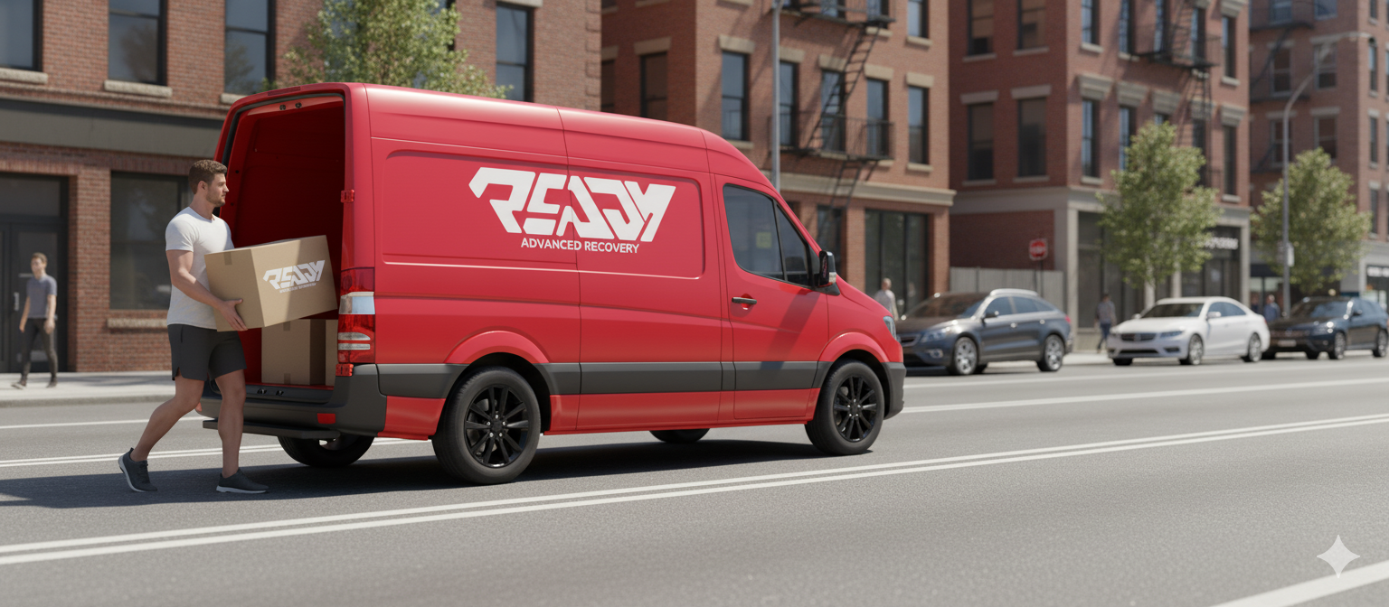
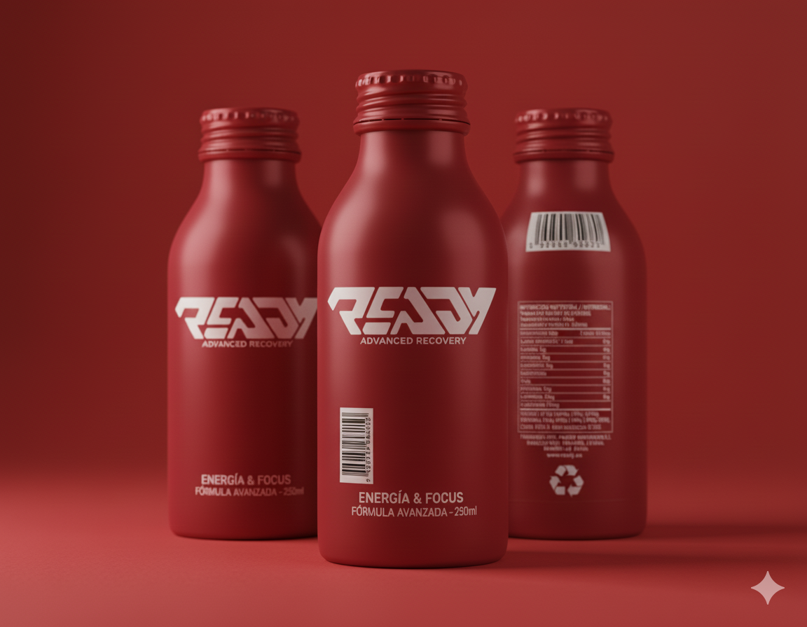
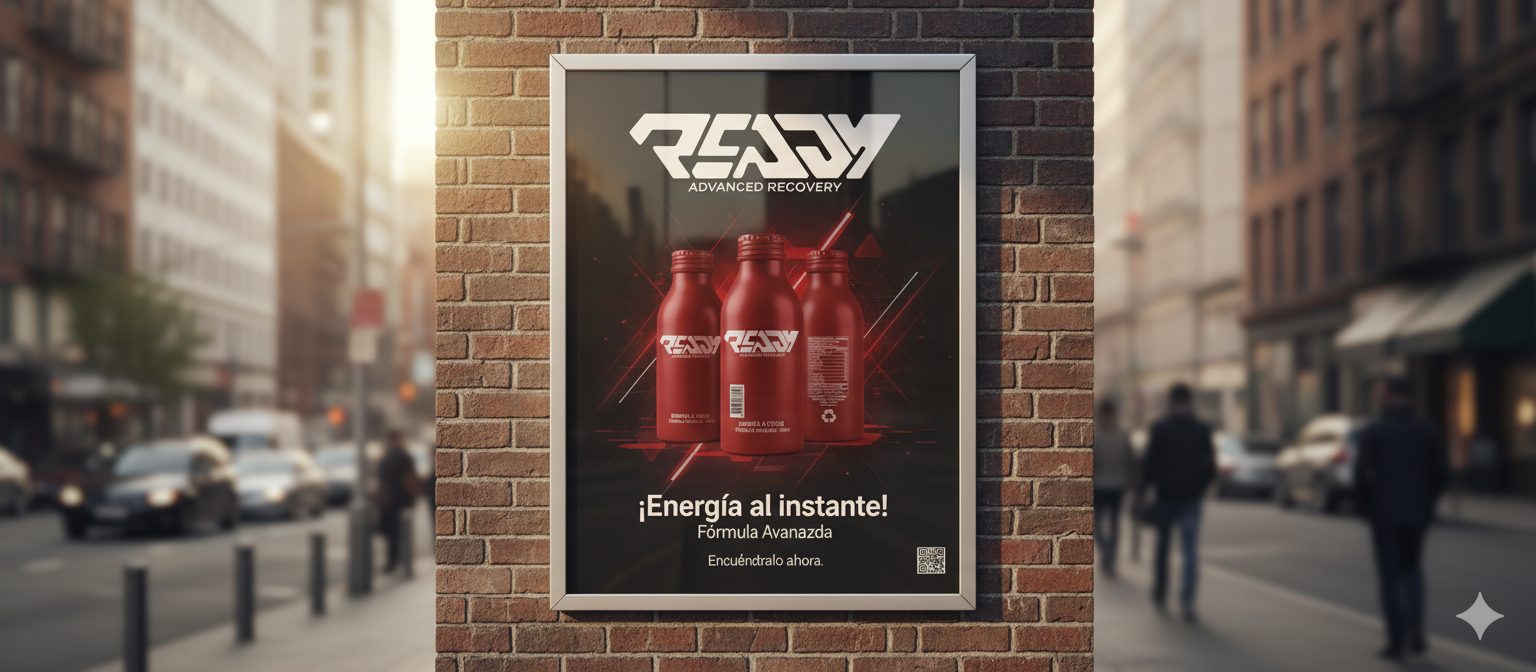
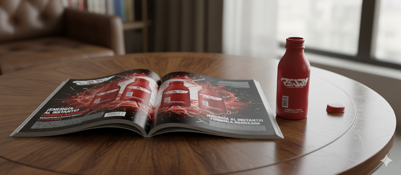
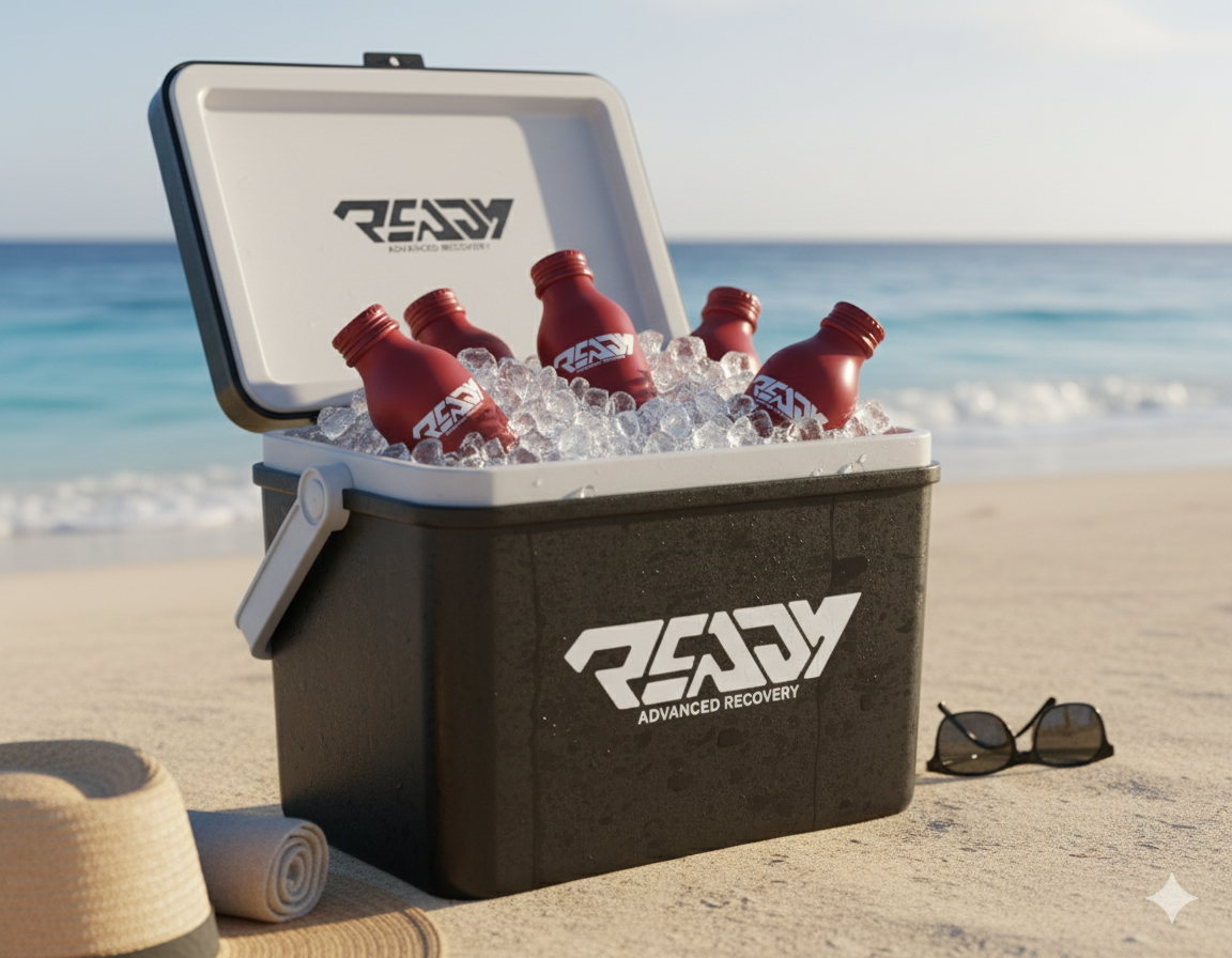
Ready’s branding focuses on strength, vitality, and efficiency. Our design communicates renewed energy, using a bold, vibrant red to evoke vitality and optimal performance. The clean, modern typography projects confidence and reliability. The dynamic logo, with a touch of movement, symbolizes the recovery process and forward momentum. In every detail, Ready is designed to inspire athletes and fitness enthusiasts to push their limits and reach their full potential, delivering a recovery experience as powerful as their workout.


LETS WORK TOGETHER